
Re: Reworking the site logo
I actually like the current Logo.
_2014
We are a friendly filmmaking community devoted to the art of stop-motion animation using LEGO® and similar construction toys. Here, you can share your work, join our community of other brickfilmers, and participate in periodic animation contests!
A place to discuss, share, and create stop motion films.

Ad
You are not logged in. Please login or register.

I actually like the current Logo.
I really support this new logo. It is simple and represents the core of this community.
I think Sméagol's logo is much better than our current one.

There are several issues with the changes you suggest. For one, the city background helps very much to keep the logo balanced, loosing it will make it feel lopsided (as the left side will suddenly be very empty) and would require that all the figures move behind the brick for it to have a nice balance, which ruins the perspective or them standing on the "table"
I guess I didn't mention this, but I had thought that the minifigures would need to be moved behind to compensate, yes. Perhaps they could be scaled down a bit so we see more of them, or the far right minifig could still not be entirely behind the brick, so as to retain the table effect. In fact, the right minifigure could stay exactly where it is, with the other two moving to the left a fair amount, retaining the 'table' illusion.
Blue does represent film, but blue is already a very prominent color in the logo other than that minifig (plus that minifig has more color than the other two despite it being behind the orange one). Also, changing the middle minifigs shirt to blue would cause a blending issue with the BiM brick.
I decided to try changing the color to see what you mean, and I haven't run into this blending issue. IMO the shade of blue actually works quite well because it's just light enough that it doesn't blend into the brick. The intent in swapping the two colors would be to make the blue minifig hold the camera and center the main color; the camera will actually obscure most of his torso and I think it's important to make the orange and green torsos visible.
Finally, I think the stud issue is different than you might imagine. The studs are actually scaled properly and it's the actual brick that's scaled incorrectly, but that's only to accomodate the name of the site. Making the studs larger will make it look even more bizarrely large compared to the minifigs (especially if you want to scale them down).
I noticed this as I was working on it - but it really depends on how you look at it, because making the studs larger in effect makes the brick a little shorter than a real one would be, but fixes the other proportions. I don't think that this looks 'bizarrely large,' see my earlier version of the logo for an example of how it looks. IMO it looks better than the current, stretched out version. There is perspective in the graphic so it makes sense that things nearer the front would be a little larger.
It looks like the notion of enhancing the logo is getting pretty mixed reception here, I'm not surprised but I'm glad people are at least considering it. It'd be interesting to get Ladon's take on this.
-Sméagol


Great work Sméagol
That thing looks like a Logo for a brickfilm-community.
But I think its to late, they wouldn´t accept this new thing - but they should.

I like the current logo better, but a camera would be cool. Maybe if the dude in green was filming the other dudes?

I much prefer the current one.
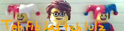

I like the new logo pretty much, but it looks a bit like a guy with a gun. Maybe I am only paranoid! ![]()

Posts [ 21 to 29 of 29 ]


