Note: These days, community activity has largely moved to the BiM Discord. Join us!
We are a friendly filmmaking community devoted to the art of stop-motion animation using LEGO® and similar construction toys. Here, you can share your work, join our community of other brickfilmers, and participate in periodic animation contests!
A place to discuss, share, and create stop motion films.
You are not logged in. Please login or register.


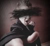
I see both your points Real Brick and BertL and I suppose I will withhold explanation but I like to explain what it is that I posted and what I was trying to achieve. I am relatively new to filming again I thought it might be dificult to read the word "Love" but still worth trying. I suppose one could have figgured it out, but I felt it was a bit busy (due to the atomosphere I was trying to create) and worth explaining in case someone glanced at it real quick and just saw a big mess of lego and shouted "This is disturbing not disturbed". I will wait next time for someone to complain and then explain.
Thanks BertL. I like your idea of putting blood on the knife, should have been fairly obvious but I didn't think of that. It is my fault the word love is not easy to read, I must have smeared in before the shot and I was just being lazy. Again I apologize to you and real brick, I entered this contest to expand my abilities and participate with the community and I got all caught up in simple criticisim. My competitive side always wants to win, but who ever entered the "disturbed" kid in parents bedroom would get my vote. I fell off the chair laughing at that one. (Then I spent a good 20 mins on the floor crying about bad childhood memories.)
Originally I was trying to come up with something involving a soldier and a cow in an alleyway with a briefcase but that didn't figure in my head ![]() So I stuck with s disturbed child.
So I stuck with s disturbed child.
This theme is actually really hard just because of trying to get across Disturbed rather than Disturbing or scared or wierded out.
Shot wise your frame is really busy as you said, and contains a lot of interesting elements but how it was taken doesn't seem that creative. Possibly a strange angle on his face and the room as well would've given more a disturbed feel to the frame..... I dunno I'm trying to think back to movies with crazy people in them.
Without the explanation my fist impression was that someone had stripped this guy, written love on his chest and left him in his trashy muso apartment/flat/unit or something, not that he'd done it himself and that he was actually alive.. I thought he'd been killed (it's been the theme so far). Maybe writing it upside down (from his perspective) or backwards (mirror writing) would've been a better indication it's self work... Like that silly girl who tried to claim thugs beat her up and carved "BO" on her forehead but the B was backwards proving that she'd done it herself in the mirror.
Btw, your copping some good critcism. Quick someone critique me I feel left out!
Thanks Sythean. I agree the shot angle wasn't the most creative. I was going for an overhead birds eye view, but the contrast wasn't working out. I figured their would be lots of ways to inturpret how and why the guy is sitting around.
Saddly I know cutters who have cut things to read from both perspective. The cuts are kind of like tattoos so others can read them, kind of like wanting attention. I remember the video Sid and Nancy (of Sex Pistols fame), yeah thats chock full of mental disturbances, and if i recall right sid was on the bed carvign something on his chest so it could be read by others in the audience when he was on stage. I didn't think of doing it from his perspective at all and that is an interesting idea.
As for your requested critigue...Your set was a little bare a bit tough to tell is was a bedroom right away, though once it clicked it was hillarious. Maybe adding a dressor or something to get accross it is a bedroom. I really don't like exterior doors (ones with windows in them) used in the interior but I don't think their are many alternatives.
I shoud be handleing copping better because I am in anger management classes and I know the outside world isn't trying to upset me and I have the will to react positively to any situation. However sometimes my head is up my rear end and the fumes dizzy me abit and I forget.
Last edited by PJ_pund (February 1, 2010 (06:29am))

Results?

I'm coming out of my Cinematography break. I'm gonna make an entry RIGHT NOW
-Jimmybob
Hurry filmguy before jimmybob makes his entry! ![]()
Greenscreener is afraid I'll beat him.


-Jimmybob
What is that Jimmybob? Im guessing spirits entering or exiting a body. Even though I don't get it I really love the color and composition of it from an abstract point of view.
Filmyguy the suspense is killing me...When are we going to know the results?
Wooly is growing impatient. Muahahahabababa!!
PJ_pund wrote:Filmyguy the suspense is killing me...When are we going to know the results?
Keep your shirt on, I'll have them up tonight.
I'm...trying...to keep...my shirt on....but it...keeps on...trying...to run away...arhhhhhh!
It's the ants in my pants I am most worried about.
Hold it... MUAHAHAHA! LAST MINUTE!
w00t w00t. A little more competition...
Not the best quality ![]()


YAY, the results are in! YOU’RE ALL WINNERS
1. Jimmybob (2), Guy gets it. This one really does it for me. Nice and simple, just wacked out.
2. Sythean, SEXY TIMES, great concept. I like it a lot, although I’m a bit torn about the lighting, it just doesn’t look that great, if it wasn’t for that, this is a first place entry IMO.
3. A. The background is incredible, like the creepy feel, although I’m not sure about the eyes, a bit over-sized.
4. Greenscreener Studios, The lighting bothers me most on this one. It makes you think the half of the house is ripped off. I like the effects and everything though, nice angle too.
5. CheeseyBricks, Very good, but to make the sunrise more realistic you need a blue background, otherwise it just looks like a flashlight in the dark.
6. Real Brick, Avoid a lot empty space in your shots, looks like you weren’t mindful of that when you shot this and quite frankly it ruined your shot. Lighting is nice, although to set the mood a little better I would have darkened it a bit.
7. Vik, I don’t like it either. jk, I just can’t tell what’s going on at all because it’s so dark that’s all. I like the quality of the image though.
8. Cartoonkid98, lol, I get it. Not very interesting though, also the lighting is pretty bad, doesn’t look like sun’s light.
9. Olsonstudios, The horrid quality kills it for me on this one. Not very interesting.
10. BuilerBrothers, Ugh, sheep? I don’t know, pretty quirky. Also the lighting makes me cry. It’s dark so there should be MUCH less light and it should have a bluish tint. That, and the eyes glowing red might serve for a better shot. But still, sheep?
11. PJ_pund, If the theme was ‘hoarders’ then this would be first place. But seriously, a lot of clutter in this shot, I couldn’t even make out the knife. Also, you shouldn’t have to explain your entry in any way, shape or form when you post it. The shot should tell you everything you need to know.
12. ScreamingTantrum, Looks like you just dumped a whole bunch of legos onto your desk. Like the lightsabers though.
This was a really hard judging, a lot of these entries didn’t really seem like first place quality. I liked how many we got this round though, I guess I did good on the theme. Give us a better one, jimmy!
Wooly knows where you live filmyguy! ![]()
Posts [ 1,281 to 1,300 of 2,270 ]