
Re: Batman Instant Freeze Update Thread
If you're gonna post all in the same day, I'd ask that you use the Edit button.
Have you seen a big-chinned boy?
We are a friendly filmmaking community devoted to the art of stop-motion animation using LEGO® and similar construction toys. Here, you can share your work, join our community of other brickfilmers, and participate in periodic animation contests!
A place to discuss, share, and create stop motion films.

You are not logged in. Please login or register.

If you're gonna post all in the same day, I'd ask that you use the Edit button.
If you're gonna post all in the same day, I'd ask that you use the Edit button.
I have been but it just reposts the same post with the extra writing at the bottom

Mickey wrote:If you're gonna post all in the same day, I'd ask that you use the Edit button.
I have been but it just reposts the same post with the extra writing at the bottom
YOU DON'T SAY?
The idea of Mickey's suggestion is not to have so many posts posted so often.
If you want the updates in seperate posts, update less frequently.
BrickCorp45 wrote:Mickey wrote:If you're gonna post all in the same day, I'd ask that you use the Edit button.
I have been but it just reposts the same post with the extra writing at the bottom
YOU DON'T SAY?
The idea of Mickey's suggestion is not to have so many posts posted so often.
If you want the updates in seperate posts, update less frequently.
oh ok:)
From now on I will only do about 3 updates a week:3 ![]()
Ive Done a bit more filming and editing and it's looking quite nice! ![]()
![]()
And thanks to everyone for voicing!!! ![]()
![]()
Probably will do another update on Saturday ![]()

I don't know if my voice was evil enough. That character looks pretty evil.
I don't know if my voice was evil enough. That character looks pretty evil.
That Character Has No Voices in that part but he turns into Mr Freeze.
If you want to redo them you can if you want! ![]()
![]()
Only if you need me to.
Only if you need me to.
If you can do it again that would be good but if not I won't be upset ![]()
![]()
What lines would you like a redo on?

You two could use the Personal Messaging system you know. ![]()
Anyway, I'm going to assume that those frames are from your film, and more-or-less final, right?
If so, they could use a little work.
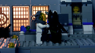
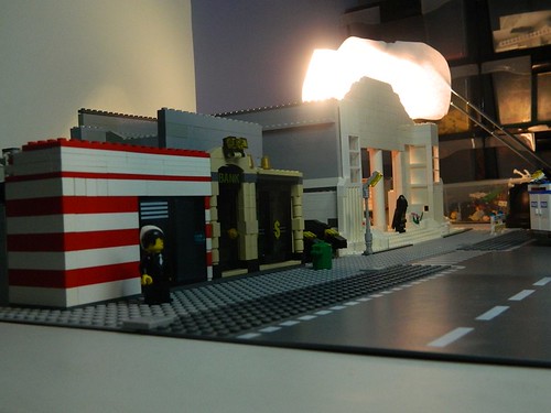
Frame #1:
That angle is fine for showing off a set, but not optimal for an establishing shot for a film. The lack of another wall next to the top-right corner of the white building makes the set look unfinished. So you should move your camera in just a bit, and then make sure the adjacent building (Or lack thereof) can't be seen. The camera is also a bit low, and angled up too much. You should have it level, or pointed down just a tad, with it elevated enough to still show the top of Freeze's hideout. The set also appears very 2-D. If you had the camera angled so that the near side of the street could be seen, and then put some benches, boxes, or other object on it, then that will help "fill-in" the space.
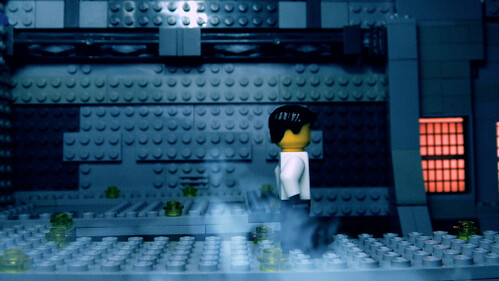
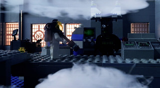
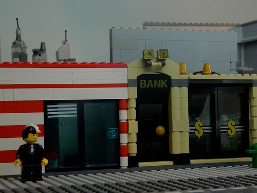
Frame #2:
I like the lighting, the warm glow of the window contrasts very nicely with the desaturated interior. It helps establish the "Warm outside world rejecting the cold hearted Mr. Freeze" aspect. But, in the middle of all that is the bright yellow minifigure head. Is there a way you could desaturate the head just a touch?
[Nitpick] There's a distracting white glare at the top of the set that is obviously coming from your lamp. In short: Get rid of it. The camera angle is fine, but it'd be cool to have it low enough so the viewers could se that he's on an elevated platform. Why you ask? Because elevated platforms are cool. And you should milk it for all it's worth.[/nitpick]
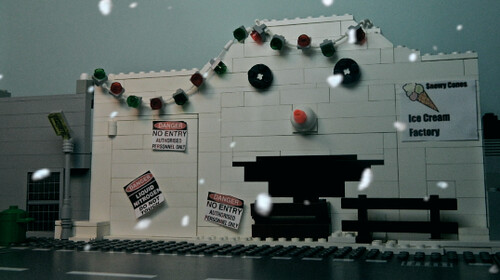
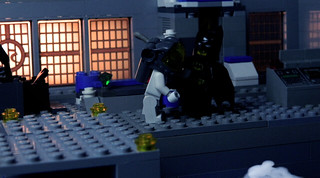
Frame #3:
Ah, yeah, I think this is the weakest of the frames. The most obvious aspect is the clouds. They're obviously normal solid white clouds that have been put on top of the picture and turned slightly transparent. And it doesn't look very convincing. "Science-lab fog/smoke" and "Pretty sky clouds" are two totally different animals.
The lighting is considerable less quality than the second frame, it seems like the brightness has been cranked up, but it may just be a side effect of the cloud picture. And one last nitpick, the pose looks super-dorky. Not sure what he's doing there, but it don't quite look natural.
P.S. What resolution are you filming in?
You two could use the Personal Messaging system you know.
Anyway, I'm going to assume that those frames are from your film, and more-or-less final, right?
If so, they could use a little work.Frame #1:
That angle is fine for showing off a set, but not optimal for an establishing shot for a film. The lack of another wall next to the top-right corner of the white building makes the set look unfinished. So you should move your camera in just a bit, and then make sure the adjacent building (Or lack thereof) can't be seen. The camera is also a bit low, and angled up too much. You should have it level, or pointed down just a tad, with it elevated enough to still show the top of Freeze's hideout. The set also appears very 2-D. If you had the camera angled so that the near side of the street could be seen, and then put some benches, boxes, or other object on it, then that will help "fill-in" the space.Frame #2:
I like the lighting, the warm glow of the window contrasts very nicely with the desaturated interior. It helps establish the "Warm outside world rejecting the cold hearted Mr. Freeze" aspect. But, in the middle of all that is the bright yellow minifigure head. Is there a way you could desaturate the head just a touch?[Nitpick] There's a distracting white glare at the top of the set that is obviously coming from your lamp. In short: Get rid of it. The camera angle is fine, but it'd be cool to have it low enough so the viewers could se that he's on an elevated platform. Why you ask? Because elevated platforms are cool. And you should milk it for all it's worth.[/nitpick]
Frame #3:
Ah, yeah, I think this is the weakest of the frames. The most obvious aspect is the clouds. They're obviously normal solid white clouds that have been put on top of the picture and turned slightly transparent. And it doesn't look very convincing. "Science-lab fog/smoke" and "Pretty sky clouds" are two totally different animals.The lighting is considerable less quality than the second frame, it seems like the brightness has been cranked up, but it may just be a side effect of the cloud picture. And one last nitpick, the pose looks super-dorky. Not sure what he's doing there, but it don't quite look natural.
P.S. What resolution are you filming in?
Thanks Pritchard For reviewing the images
I think my main problem is time constraints cause I want to give a good film but not spend my whole week just trying to make it 1 scene look good but I'm trying my best.
And the smoke is not clouds it moves around and looks better when not in a still frame. ![]()
And I'm filming at 4320x3240 resolution on a Nikon L120
And sorry I should be using the PM system!

Beautiful so far!
Beautiful so far!
Thanks! ![]()
![]()
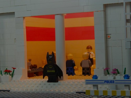
Just 2 images from animating:):)
From animating? Hmmmm....
The lighting is too dark for a day shot, but too bright for a night/late evening timeframe.
The angle also highlights the 2-D aspect of that set that I was talking about earlier. It's quite obvious that the buildings are nothing more than short wall panels, and that there's a great big wall a few inches behind them.
Not that you asked for my opinion. ![]()
From animating? Hmmmm....
The lighting is too dark for a day shot, but too bright for a night/late evening timeframe.
The angle also highlights the 2-D aspect of that set that I was talking about earlier. It's quite obvious that the buildings are nothing more than short wall panels, and that there's a great big wall a few inches behind them.Not that you asked for my opinion.
Well I kinda quickly changed the Brightness on preview to make them look better.
And I really enjoy reading your responses to my posts!!! ![]()
![]()
They help and give me enthusiasm to keep on going! ![]()
![]()
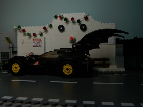
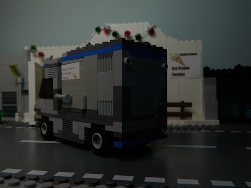
Hi guys another update again!!:)
Almost finished filming all the scenes for the hideout and I'm Happy with how it looks! ![]()
I'm still needing suggestions for buildings you want to see during the car chase so post a comment below telling me some buildings you want to see during the chase!!;)
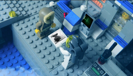
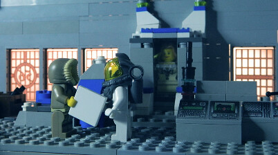
Here's 3 edited frames for the final battle which is almost complete!:)
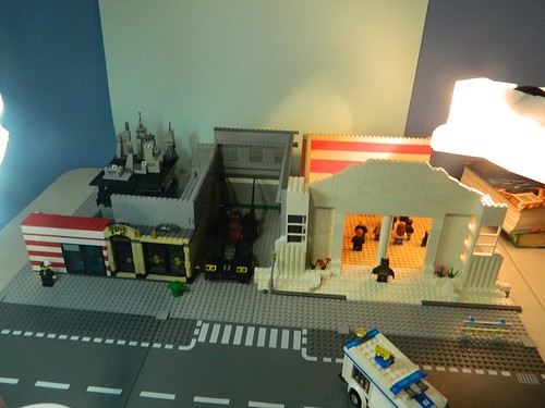
I am also now working on building the Town Hall which I Will post a Image of Next Update!
I Hope you like the frames:D
Town Hall Set is 90% finished I just need to add more figures, vehicles, straighten bricks, add bricks and fix some minor things. ![]()
![]()
![]()
![]()
![]()
![]()
![]()
![]()
Stay Tuned For more... ![]()
![]()
![]()
Posts [ 41 to 60 of 97 ]


